
A subject whose importance is growing day by day,but even so, very many choose to still ignore it.The subject of FONTS.For those who have studied web design & development,app development,graphic designer,UI/UX or any of those related fields in which you need to use fonts,you will agree with me that the subject of fonts,crucial as it may be,is hardly touched.Personally,I think it because of the rising use of templates,which has left many to simply use the default font the template came with.Not that I dispute the use of templates,I just don’t believe in taking everything the template came with.
In a world of constant change in the world,technology itself having a lag rage of about 60 days;pretty much everything has been invented.Just google your idea right now (that app you have in mind or blog idea), and see if it has not yet been done before. Meaning,majority of the “inventions” or innovations are not on the functionality (what the app can do) but on the user interface and experience.How is this relevant to fonts,right? Well,it all is.
UI and UX encompasses a lot of things and their technical definitions vary according to who you are talking to.However,like always,I prefer keeping things simple and using definitions even grandma could understand.To me,UI is how the whole platform/app/website looks in terms of layout and UX is simply the feeling or connection developed by the user while interacting with various components of the layout.So the two are pretty much linked up,the UI greatly influences the UX and vice-versa.
Bringing us back into the beginning,where does fonts fall in all of this.The right font selection contrary to what most people think can greatly influence the general feel of your website or application.The right font choice,size,letter spacing along with absence of unnecessary distraction improves the whole reading experience and makes everything feel easier.A study by psychologist Kevin Larson,who has spent an enormous tone of years studying typefaces, recently showed that fonts can affect our moods.The study which involved twenty volunteers (equal number of men and women) proved that a poorly designed layout and font choice made readers feel bad about reading a piece,with some even showing physical signs of frustrations by frowning.So you can imagine how a user would fee when they came to your website and the fonts were so poor that they ended up frowning.You can bet a 1oo bucks that user won’t come back to that page.
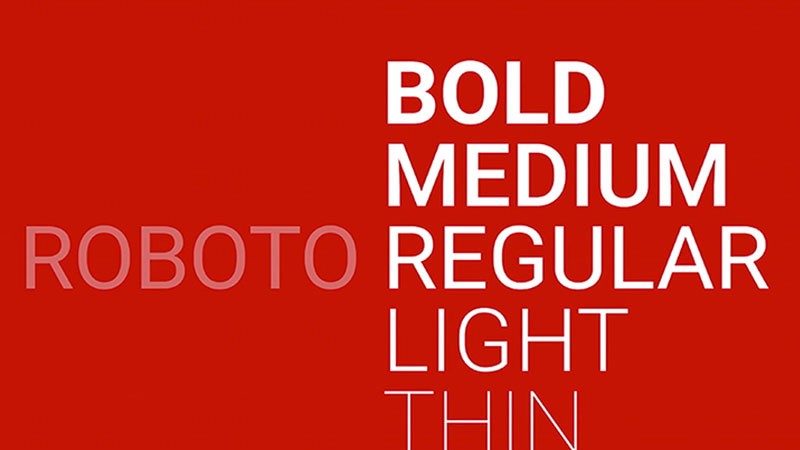
So how else are fonts useful aside from improving the user’s reading experience.Four words;Brand identity and emotions.Let’s start with the first one,brand identity.Users can begin to identify with your brand if you are consistent on the types of fonts you use.That is why I personally wouldn’t advice copy pasting the templates fonts.Pick a set of typeface,and stick to it.Again,certain fonts spark certain emotions(not the ones Larson was studying about).For instance,some fonts speak tech,other speak love whereas others speak corporate or business.The font you choose would depend a lot on the type of emotions you wish to convey.Fonts like Helvetica speak business/corporate while others like Raleway can be used to convey “techy things” in a fun mood.
My final thoughts on the subject?Fonts are wide,and I would be a liar to presume I know and understand them all.But I do know the basic,which is keep it simple and readable.If you are not sure about which font to go,their is always google fonts to choose from.Take your time until you find what you like.If not,keep it plain old simple Arial.